Product Design · Desktop
As a part of a JPMorgan flagship treasury platform, this experience streamlines the report delivery notification set-up and customization process.

DURATION
Feb 2025 - Apr 2025
TEAM
Stakeholders
Engineering partners
ROLE
Lead product designer
Strategy
The problem
The current configuration workflow requires 5+ manual steps, with errors in 33% of reports and set-up times of over a week. This prevents users from adjusting reports quickly to meet fast-changing operational needs.
My impact
5 -> 2
5+ nested steps to 2 clear workflows.
-90%
Rework cases, shortened cycles.
Confident
Restored in engineering and compliance.
Project background
Users can create two types of reports called ‘Product,’ each with different 'sub-products' fields.
💡 Challenge: simplify the experience enough for consistency while still respecting compliance-driven variations across sub-products.

Statement product
Advice product
Statement sub-products
Advice sub-products
User persona
My target users are detail-oriented, not too tech-savvy individuals troubled by the complex interface and broken workflows. They want an efficient, accurate, and transparent user experience.



Responsibilities
Set up and customize delivery notice
Pain Points
Broken workflows
Time-consuming set-up
Goals
Efficiency
Personalized
Final deliverables
Select Client Profile ID and sub-product
Instead of selecting Account Numbers immediately after the Client Profile ID selection, the new mental model prompts the users to pick the sub-product first.
Express set-up
After account numbers are picked, selecting 'Express Set-up' will only prompt one set of email input boxes.
Duplicate an existing set-up
Entire set-up's are duplicatable with one click, saving users precious time and avoiding repeating action of reentering information.
Create new sub-product set-up
A brand new template will appear if users choose to configure a sub-product from scratch from the beginning.
Current experience
Through quick usability testing with two operations analysts, I learned users approach the workflow with two mental models, but the current experience only accommodate one.

“Wait, should I pick the account or the report first?”
Due to time crunch, I was forced to jump straight into designing
My first approach tried to embed everything into a grid, but sub-products with 10+ scheduling fields broke the model, creating endless horizontal scrolling and reduced clarity.

The solution required rethinking the workflow from the higher level, not just the UI.
I persuaded my stakeholders that UI tweaks alone wouldn’t solve the root problems of errors and inefficiency.
#1
Create an intuitive experience with logical flow.
WHY IT MATTERED
Poor flexibility leads to errors & slow workflow
WHAT I DID
- Separated starting point from one to two
- Cut town layer of info. from five to three
- Advocated for optimal user experience to cross-functional partners
1-1 Workshopping a better user experience
To start, I convinced my PM and his manager to join my interactive mapping workshop to solidify our goals by crafting new hypothesis, workflows, use cases, user actions, and tasks. I also invited another designer with deep domain knowledge to back me up when necessary.

Together, we crafted design guidelines:


Grids are useful for multi-account management, but shouldn’t limit the experience.
Users must be able to configure once for many accounts, or individually.
Duplication must exist to prevent redundancy and minimize errors.
1-2 Diverging starting point
The old workflow contains 5-layers of complexity, leading to user confusion and errors.
I proposed eliminating one layer of complexity by diverging starting point from one to two.

1-3 Alternating operation order for flexible information entry
Next, I altered the order of information entry to naturally accommodate both configuring in bulk and configuring individually.

The new workflow now Balances efficiency with precision.


#2
Give users full autonomy to customize reports on macro and micro level.
WHY IT MATTERED
Un-customizable reports lead to extra unnecessary labor
WHAT I DID
- Conceptualized and introduced Express and Custom set-up
- Ideated two ways users can enter emails
2-1 Introducing…bulking!
An important new feature I proposed was the ability to configure all accounts at once to omit entering same emails again and again for each account.
To minimize errors, I workshopped clear labeling names with my PMs to safeguard accuracy.

Express: bulk configuration
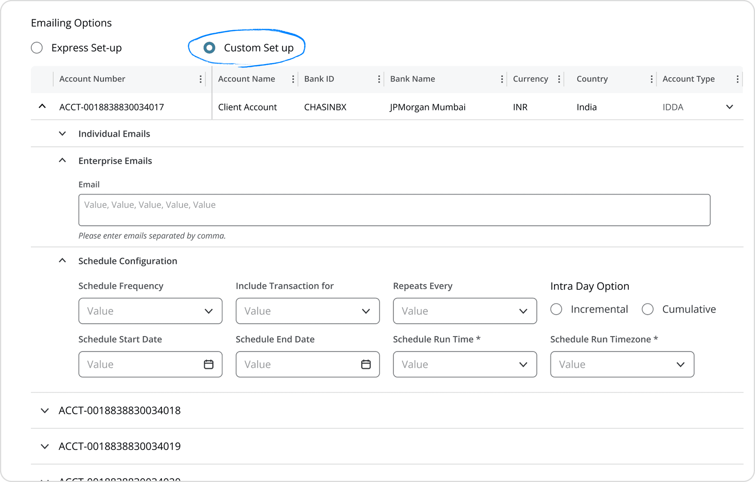
Custom: individual configuration
Advice products have an additional configuration portion for scheduling. Similarly, I want it to maintain the flexibility to apply-all or enter-individually.
#3
Allow users to duplicate entered information with ease.
WHY IT MATTERED
Lack of duplicate leads to work redundancy
WHAT I DID
- Created duplication feature
- Added duplication logic
3-1 Setting limitations
I made duplication only available for completed configurations to avoid unfinished set-ups.


Entire setups could be duplicated but requires edits before saving.
Engineering initially pushed back on the complexity, but I argued duplication was critical to meeting our error/time reduction goals, and they eventually complied.
Lessons & Challenges


Take a step back
Don’t ask = it’ll never happen
More projects

Transaction Monitoring
Payment tracking and monitoring for single and batch transactions.

Storymap
Brainstorming tool for comic artists to unleash their creativity.