
I was the first product design hire at Waffle, an insurtech start-up spawned out of MIT and TechStars that provides personalized and budget-friendly insurance offerings. I collaborated with the founding growth manager to revamp the entire core product's desktop and mobile experience, resulting in a 251% conversion rate increase. I also played a pivotal role of introducing best design practices to the engineering team by establishing a design system and relative guidelines.
OVERVIEW
DURATION
Nov 2021 - May 2022
TEAM
Growth manager, engineering partners, founders
TOOLKIT
Figma
ROLE
Product Designer, strategy
Project Background
The current experience to get insurance is stagnant, confusing, complicated, and discouraging. According to a KFF survey, nearly half of the insured adults never solve their insurance related problems. Another dominant issue is affordability, which in some cases lead to individuals not receiving care and protection.
Waffle's Approach
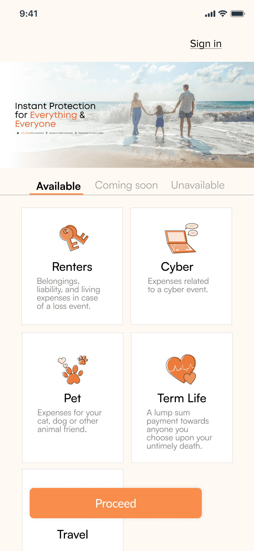
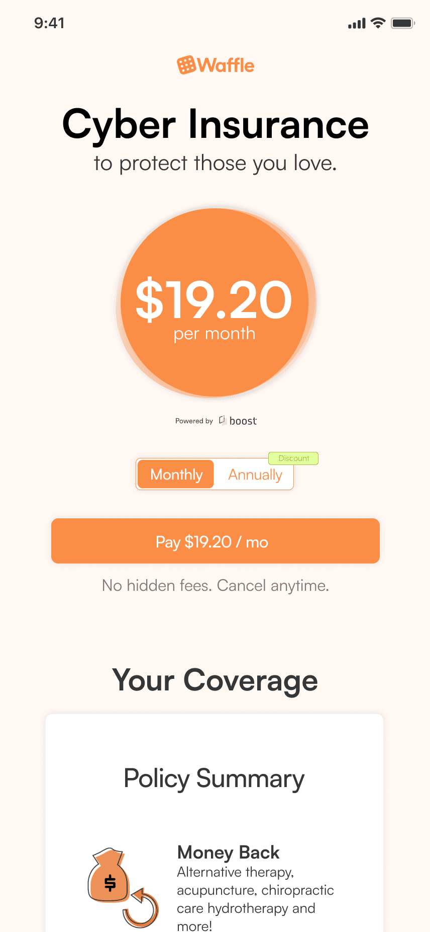
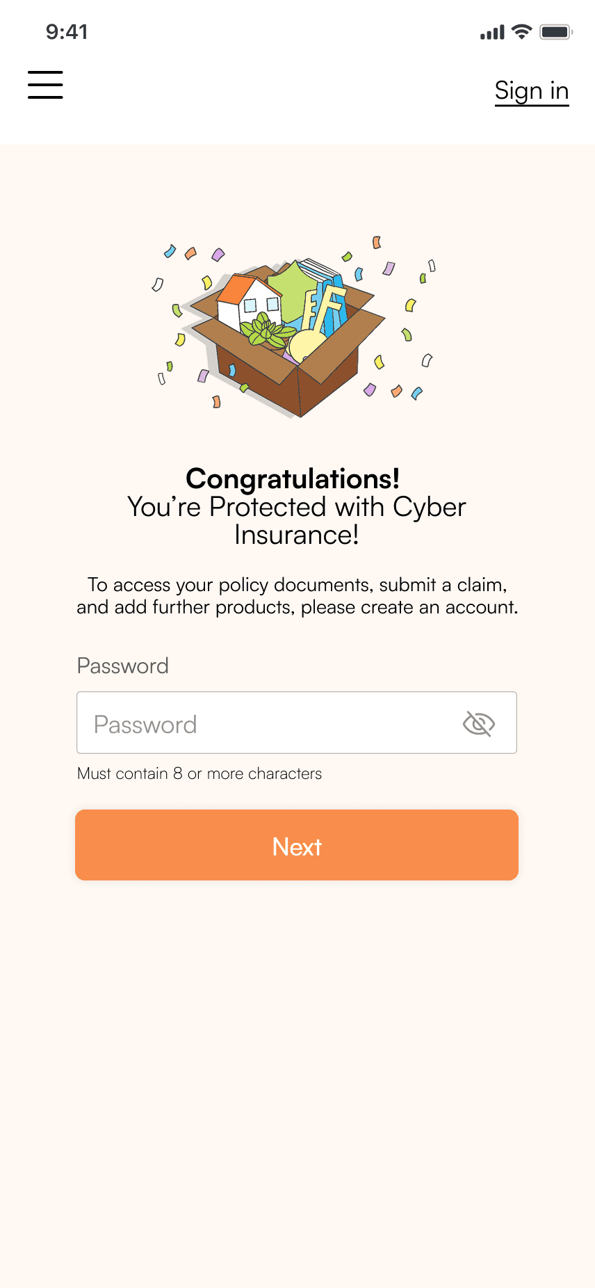
Waffle's offers Home, automobile, term life, pet, renters, cyber, and travel insurances with an emphasis on digital first approach. We also provides the flexibility for users to manage all of their policies on the platform to omit lumbersome paperwork and time-consuming calls. During my internship, I helped launch the Home screen, onboarding flow, and end-to-end renters, cyber, term life, pet, and travel purchasing experiences.
Delivered Product
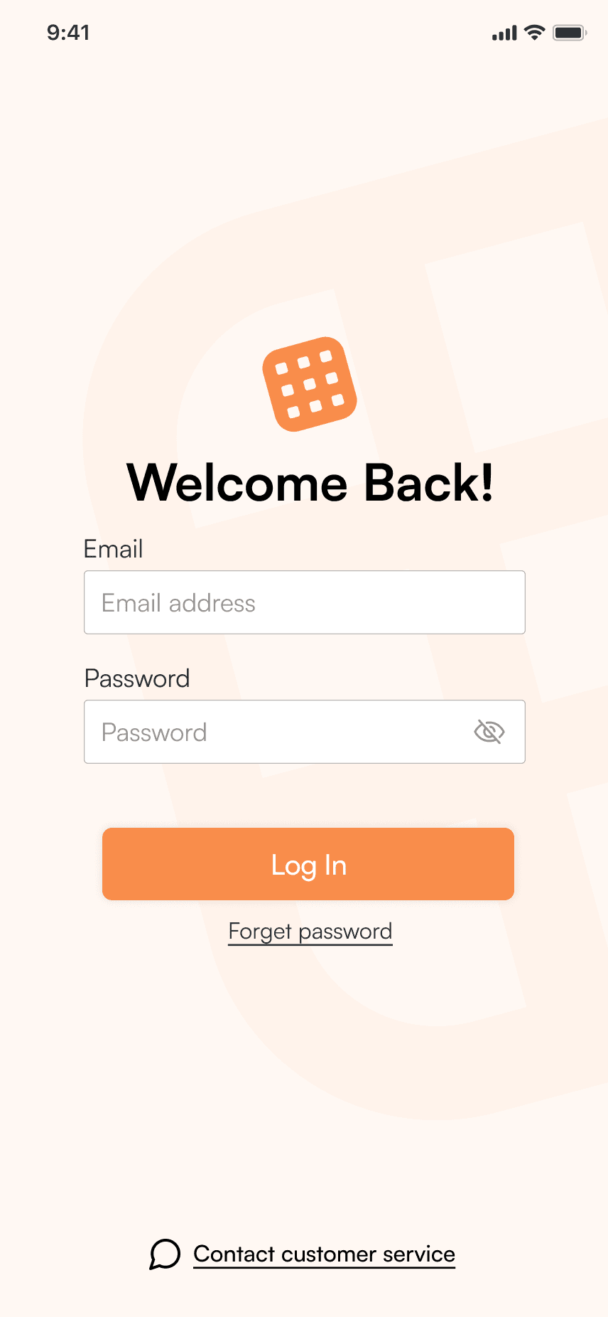
Seamless Onboarding
Waffle allows quote initiation without sign in. Users can start the process by simply entering their zipcode and selecting a service.
Quote Customization
Users have full autonomy to customize offerings, see the service available to them and decide whether to proceed.
Complete Purchase
Set up start date and billing information to finalize the quote.
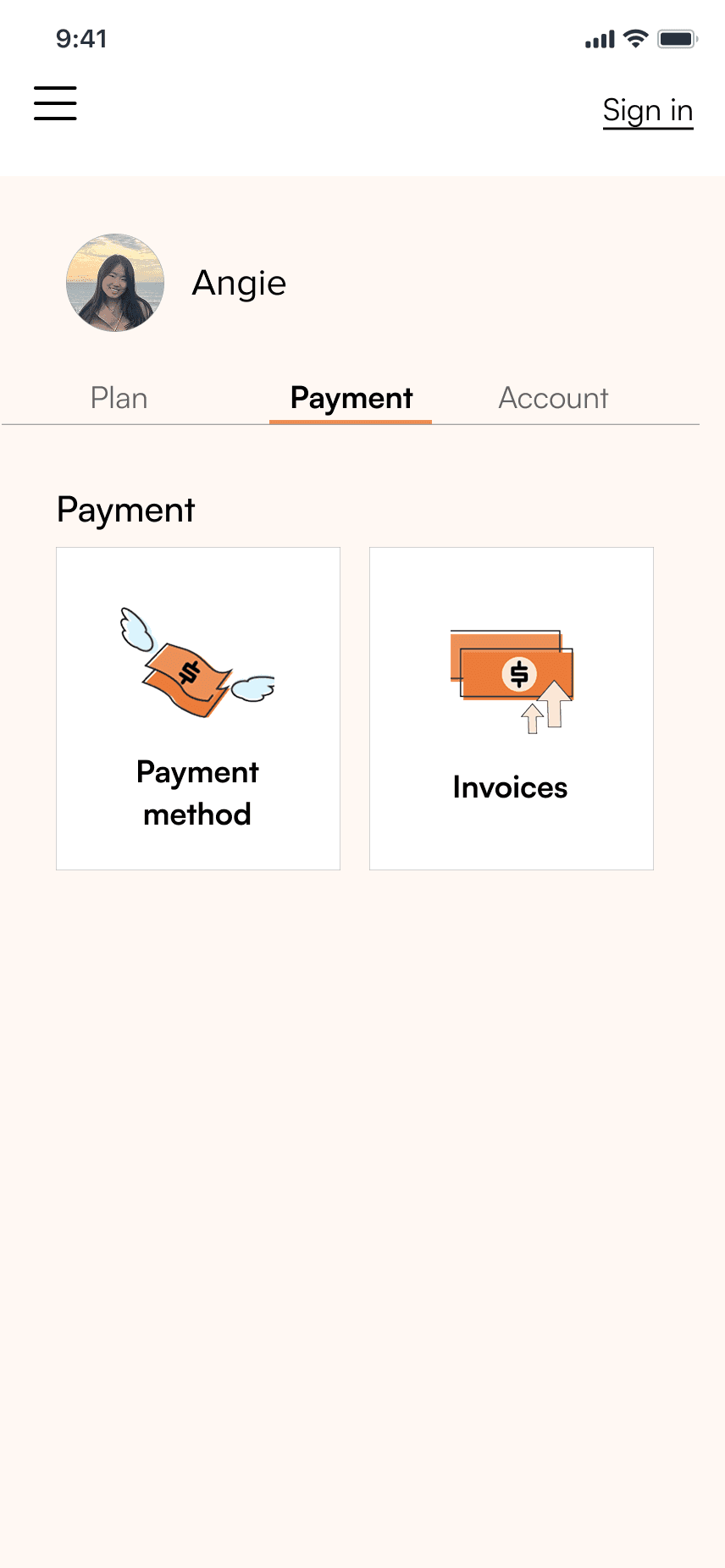
Home Screen & Accounts
Users can see an overview of all their active plans, upcoming/overdue payments, and see more information for a specific subscription.
STEP THROUGH THE PROCESS
Competitive Analysis
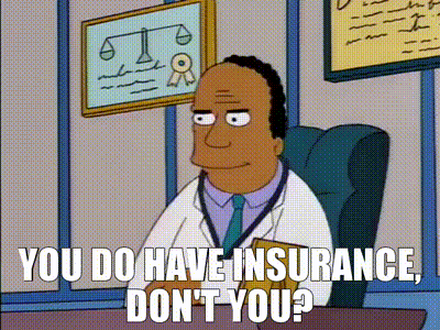
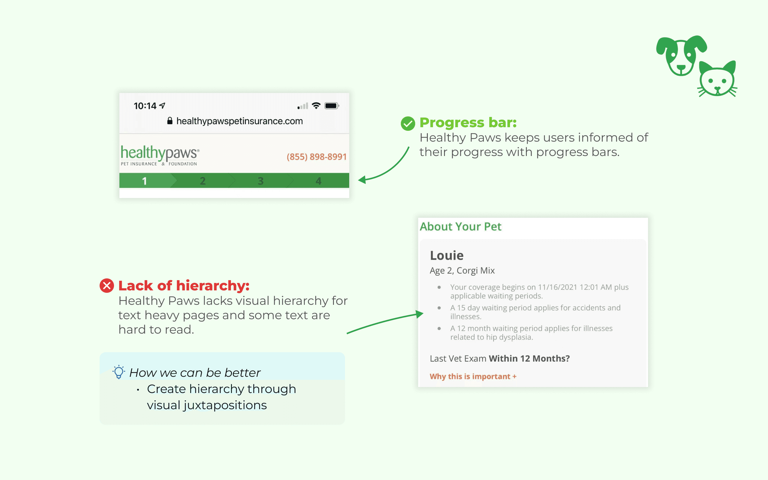
To familiarize myself with the insur-tech industry, I played around with existing insurance software (Lemonade, Healthy Paws, Geico) and analyzed their user flows to understand the strengths and weaknesses of each.


FOOD FOR THOUGHT
What makes a seamless insurance purchasing experience?
Using the insights I learned from our competitors combined with Waffle's feature goals, I concluded
four design implications to strive for:


Informative Directions
Customizable Attributes
Users need helpful guidelines to navigate
throughout the experience.
Users need the ability to put in their information
and receive a desired quote.


Visual Hierarchy
Centralized Management
Users need clear interfaces that help them
identify the most useful information.
Users need an one-stop hub to oversee and
manage all of their plans.
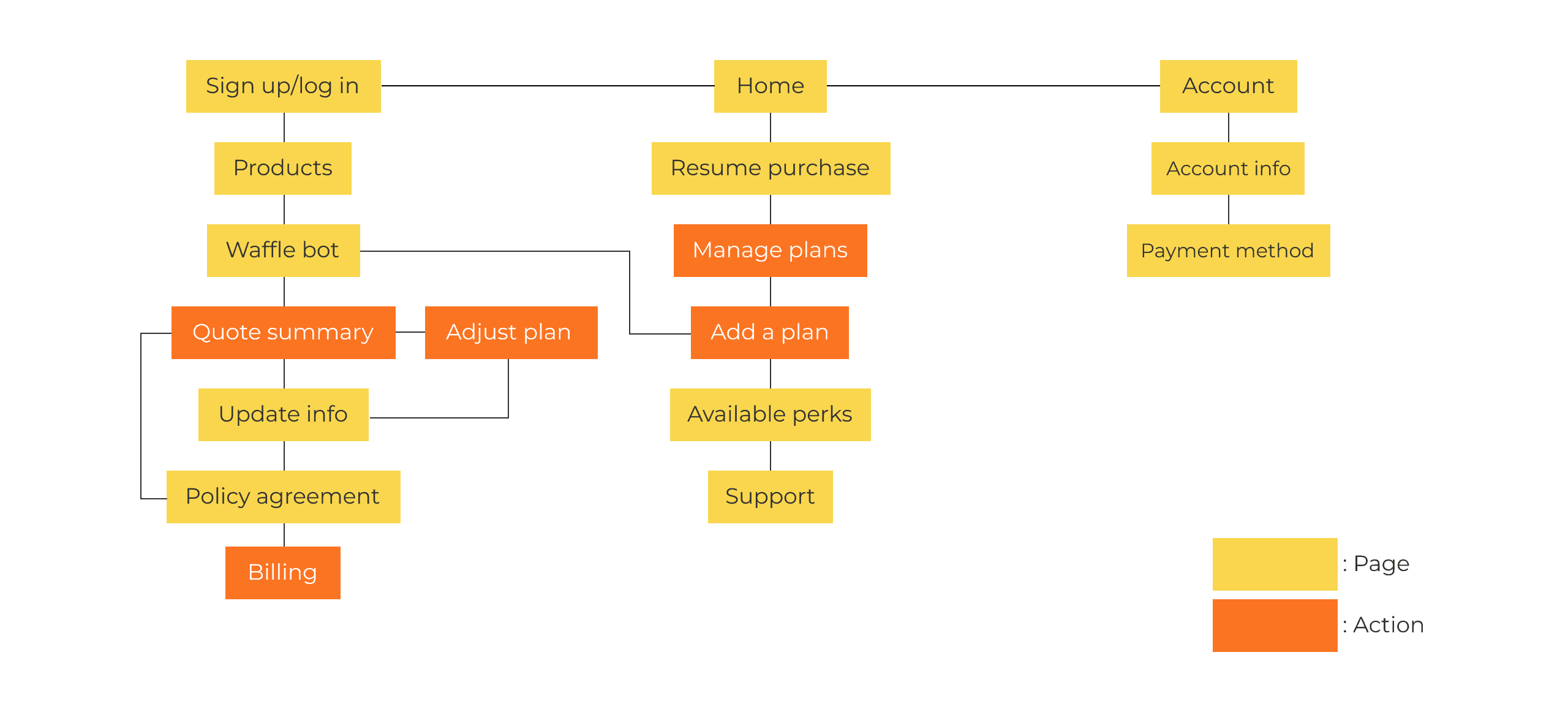
I then mapped out the information architecture of the user-flow to see how the needs can be
incorporated into various functions in the app, especially at places where action is required from the
user to reach their goal.
IDEATION
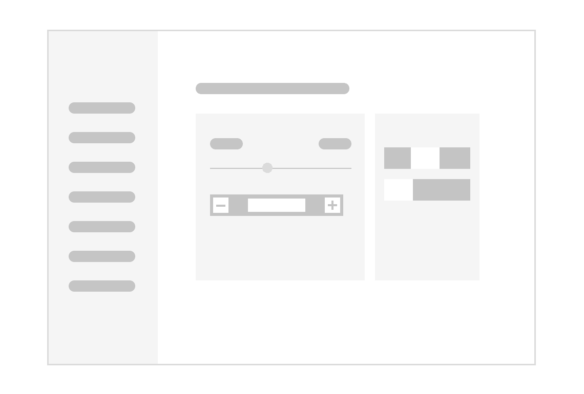
01 Experimenting in Low Fidelity

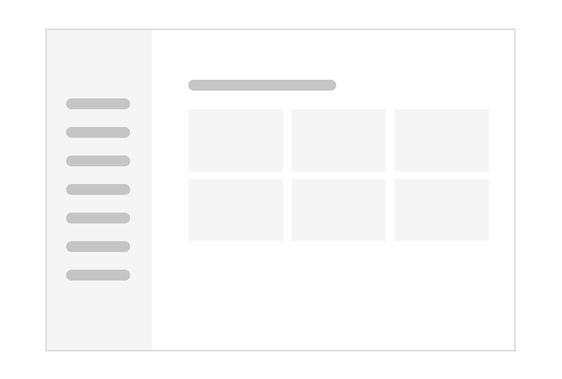
The left menu is static and easily accessible at anytime.
Users advance by clicking forward
or backward buttons with a
progress indicator at the bottom.
Users can view all of their existing
plans at one place as cards, easy to
organize status and charges.


Existing plan cards can be
expanded to show more details or
complete further actions.
The quote summary page will be
populated with adjustable variables
such as sliders and switches.
Utilizing hierarchy and contrast to
guide user attention as they read
through their quote.
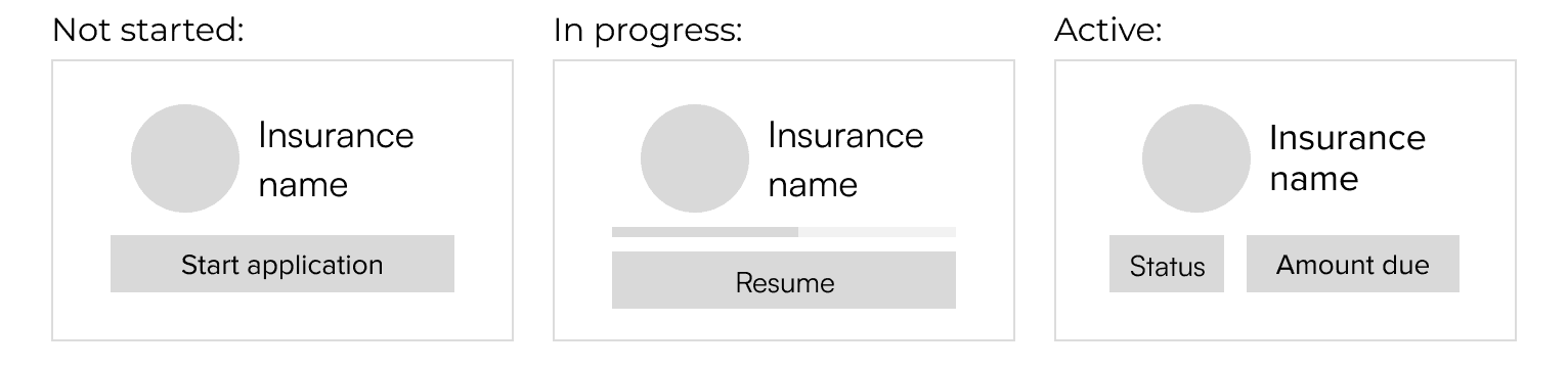
02 Card Iteration - Managing Existing Plans
After receiving confirmation from the growth manager to move forward with displaying plans on the
home screen, I iterated on their design with the goal of minimal cognitive effort. I also gave users the
ability to pick up unfinished applications or start new ones. As a result, a card can be in one of three
states:
Because Waffle lacks a design system, I spent a lot of time exploring the card colors and illustrations. I
started with a set of vibrant and beige styles but later abandoned them due to cognitive overload. In
order to strengthen the overall Waffle brand, I requested to hire an illustrator who provided branded
graphics for me to work with.

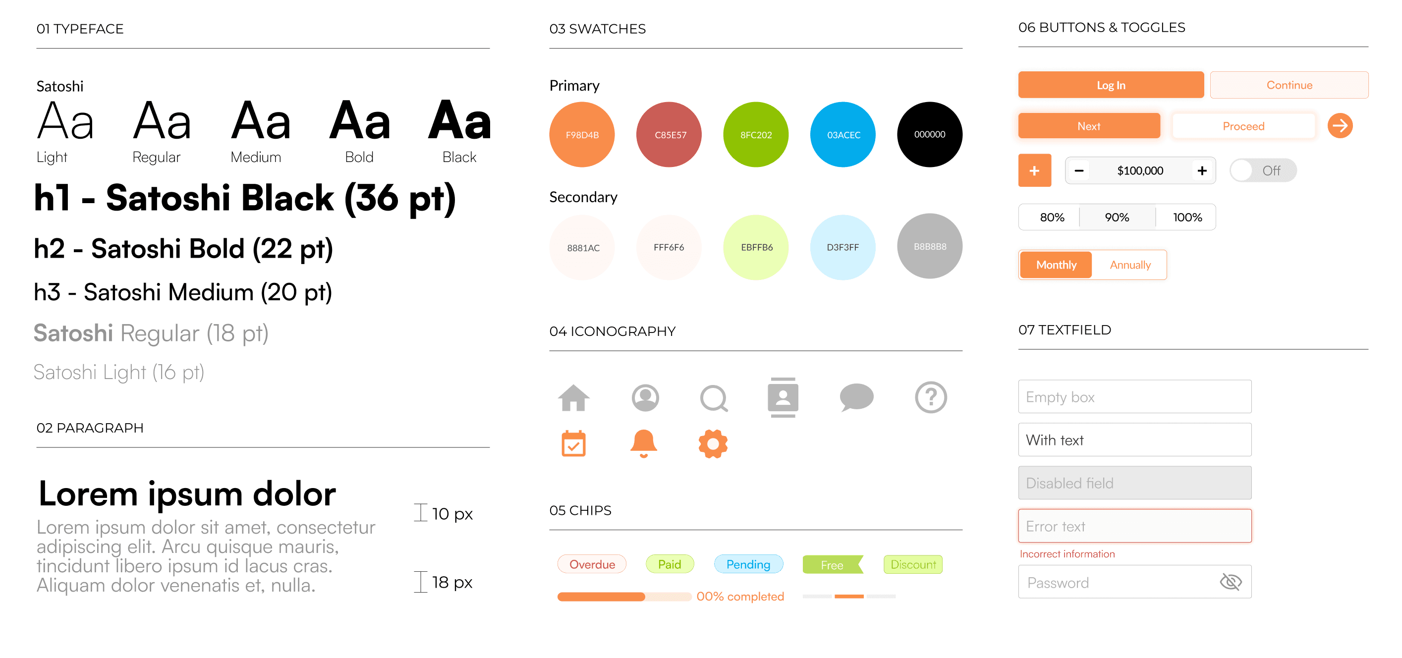
Starting a Design System from Scratch
I got started on a design system for Waffle during the second half of my internship because of
difficulties to maintain consistency. I employed the Waffle orange as the dominant color and came
up with a series of swatches and their secondary colors for the status chips.
Mobile Adaptation
Though Waffle is a desktop first application, I ideated screens of a mobile experience for users who
wish to access Waffle through their phone browser. Our goal is to eventually launch a mobile
application as it is an industry trend to shift from desktop to mobile.


REFLECTION
My Biggest Takeaways
Lessons & Challenges


Lead with Confidence
The Importance of Design System
Feeling Thankful
This is my first time designing for an actual business and the first time I got paid for my work! (welcome to the scary world of adulthood I guess?) I want to thank Diamonde, the head of growth manager, for her wisdom and patience, it was a blast to work with you and the Waffle crew 🧇!