Product Design · Desktop

DURATION
Apr 2022 - May 2022
TEAM
Head of design
Senior product designer
ROLE
Product designer
Strategy
The problem
Vowel relies on recorded meetings to unlock its core values: transcripts, action items, and shareable moments. But new users often enter the app with no clear direction, encountering empty states that felt static and disconnected. Without guidance, they failed to reach key "aha" moments like recording a meeting or sharing a clip, leading to low adoption of key features.
Project background

Vowel is an all-in-one video conferencing platform that enriches individual and team meetings through a series of features:
Upcoming: a user's future meetings scheduled in their Google Calendar.
Recent: a user's past meetings.
Action items: tasks assigned to a user during a meeting.
Shared with me: recordings of meetings & clips shared with a user.
Shared with others: recordings of meetings &
clips shared with a other users.
By transforming underutilized states into onboarding touch-points, I helped first-time users understand Vowel's core value: meeting recordings, sharing, and collaborative follow-ups.


Pre-meeting
During-meeting
Post-meeting
Functions: Agenda,
Reoccurring meetings
Users can plan out the meeting beforehand by drafting the meeting agenda.
Functions: Notes, transcript, reactions, Assign action items
Users can customize the
meeting by editing notes,
assigning tasks, etc.
Functions: Re-watch recording, Complete action items
Users can watch recorded meetings and clips and review action items assigned to them.
User persona
My target users are remote first workers who spend a good percent of their work time online and relying on meeting tools to get goals aligned and work done.

Current experience
To better understand the first-time user experience, I documented my own navigation through the interface and identified moments of confusion or hesitation. I also interviewed several team members about the challenges they faced when they first used the platform, uncovering key friction points in the onboarding flow.
Paint point #1: Lack of direction
The pages are empty and fail to provide useful information or clear next-step directions. In the example below, users might wonder what the 'list' is referring to.

Paint point #2: Weak connectivity
The overall flow between the empty states lacks continuity and creates a fragmented experience. Without clear narrative or logical progression, users navigating these pages in a non-linear order are left confused about how the features connect.

Users struggle to
#1
Make sense of the illustrations
Visuals feel abstract and disconnected from actual tasks.
#2
Connect Vowel’s features
Unaware of the features' full potential nor how to activate them.
#3
Understand what to do when they first log in
Lack of direction causes confusion and hesitation.
Business goals



Increase new users activation
Guide users toward meaningful first actions.
Drive adoption of key features
Educate users on the value of Vowel’s differentiators.
Strengthen user retention
Minimize confusion so users can find answers on their own.
#1
Utilize visuals and language to clarify complex feature flows.
1-1 Creating meaningful illustration that works
I examined the steps to achieve 'Action items,' 'Upcoming,' and 'Recent' meetings and picked out the most important components from those actions to create some low-fidelity graphics.

Action items
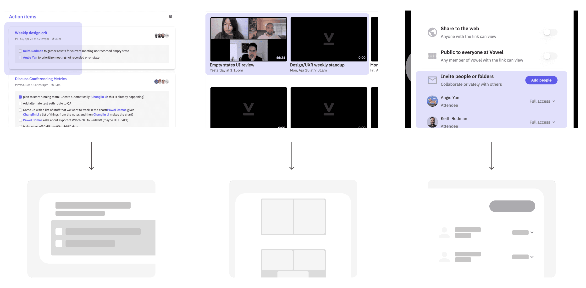
Upcoming & Recent & Shared
1-2 Expanding the color palette
I added several gradient variations from the signature Vowel purple [#6F60F6] and boosted the original color system to be more smooth, colorful and balanced.

#2
Turn passive empty states into interactive onboarding steps.
2-1 Strengthening the copy
I redesigned the written language to be friendly, educational, and action-oriented. For each empty state, I introduced concise explanations with a single next-step CTA. This clarification helps users move smoothly from curiosity to action.
Upcoming
Message: Oops! You don’t have any upcoming meetings. Meetings created through Google Calendar will appear here. Past meetings are stored in ‘Recent’.
Call to action: Go to 'Recent' button
Goal: Inform users what is stored in 'Upcoming'
Possible next step: Users navigate to 'Recent' to check out their meeting history
Recent
Message: Record a meeting and rewatch it later during your own time. Recorded meetings will show up here.
Call to action: Start your first meeting
Goal: Inform users how meeting are added to 'Recent' and to record meetings
Possible next step: Users click on button
Things to consider: Does the copy on the button fitting for all circumstances?
Shared with others
Message: You can share a recorded meeting or clip with others. Access those recordings from ‘Recent’.
Call to action: View recent meetings
Goal: Inform users what is stored in 'Recent'
Possible next step: Users click on button
Things to consider: What if the user chooses not to follow the button?
Final deliverables
Action items
As the initial landing page, I curated three key steps that guide first time users to create their first meeting and find it in Vowel.
Upcoming meetings
Because first time users won't have any meetings scheduled, I utilized this opportunity to guide them to check out the Recent meetings tab.
Recent meetings
Upon arriving at this tab, users are informed of the purpose of recorded meetings and how to get them.
Shared with me
When users arrive at this screen, they are introduced to the sharing functionalities.
Unrecorded meetings
Instead of ending a meeting on a negative tone, I ceased this opportunity to further lecture potential new users the advantages of recording a meeting.
Lessons & Challenges


The power of copy-writing
Balancing control with autonomy
More projects

JPMorgan - Transaction Monitoring
Payment tracking and actions for single and group transactions.

JPMorgan - Email Delivery Config.
Payment report delivery customization and set-up.